
Esyn
Building a brand identity for an AI fintech startup
Building a brand identity for an AI fintech startup
- Developed comprehensive brand identity for AI-driven financial data startup
- Created minimalist, distinctive visual system based on the concept of data flow
- Designed cohesive elements from logo to UI components for a modern fintech presence
Overview
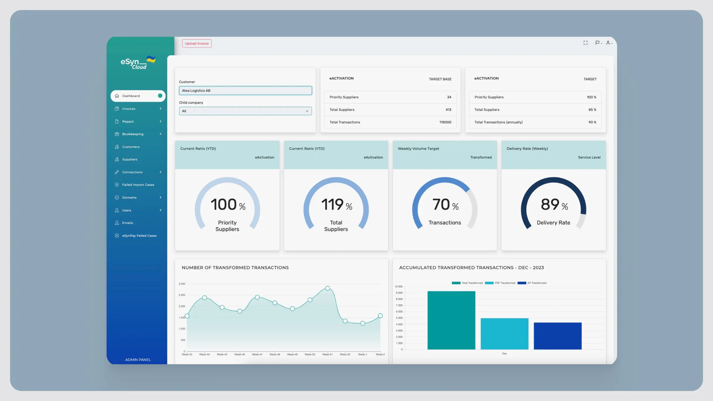
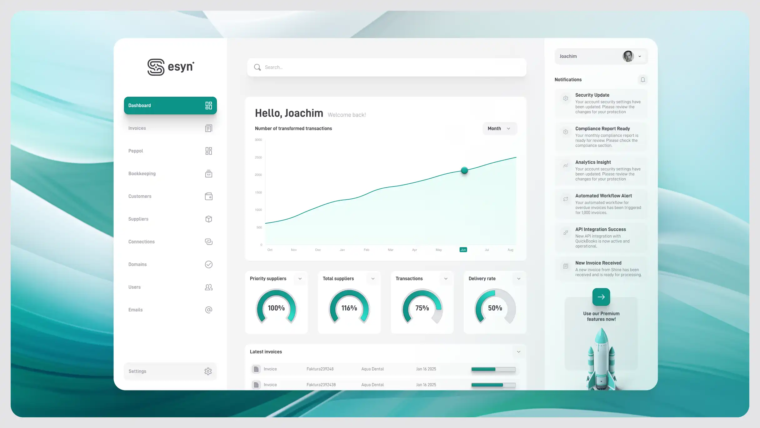
esyn is a Stockholm-based AI fintech startup building a digital invoice management and B2B data transfer product. Product design has been my main focus, but I've always had an interest in branding, and this project let me build esyn's full visual identity from the ground up.
Context
I started by learning esyn's history, market position, and what set their product apart, the usual groundwork before any brand decisions get made.
One approach I like: imagining what a company would be like as a person. For esyn, that meant precise and dynamic, modern but trustworthy. Those qualities became the brief for everything that followed.

Approach
For the symbol, I wanted something minimal that still said something specific. Drawing on the 'S' in esyn's name, the mark reflects the flow of data and the integration between services. Paired with the D-DIN typeface for the wordmark, the logo reads as both technical and approachable.

The color palette settled on greens and teals with touches of cyan and grey, reflecting the clarity esyn brings to financial data.

Iconography went 3D to signal modernity and to make abstract concepts like security and analytics easier to read at a glance.

For illustration, abstract shapes represent the flow of data, echoing the same visual language as the logo.

From there, the identity was applied across the app icon, UI, and marketing materials to keep everything consistent.

Reflection
Seeing the identity align with esyn's product and message, and watching the client's reaction to the final work, confirmed something I keep coming back to: a strong brand is what makes a complex product feel legible.
Visit live investment website