
Valueguard
Elevating property valuation with user-friendly design
Elevating property valuation with user-friendly design
- Transformed complex property valuation tool into an intuitive, customizable interface
- Created adaptive layouts for both novice users and real estate professionals
- Validated design improvements through extensive user testing and analytics
Overview
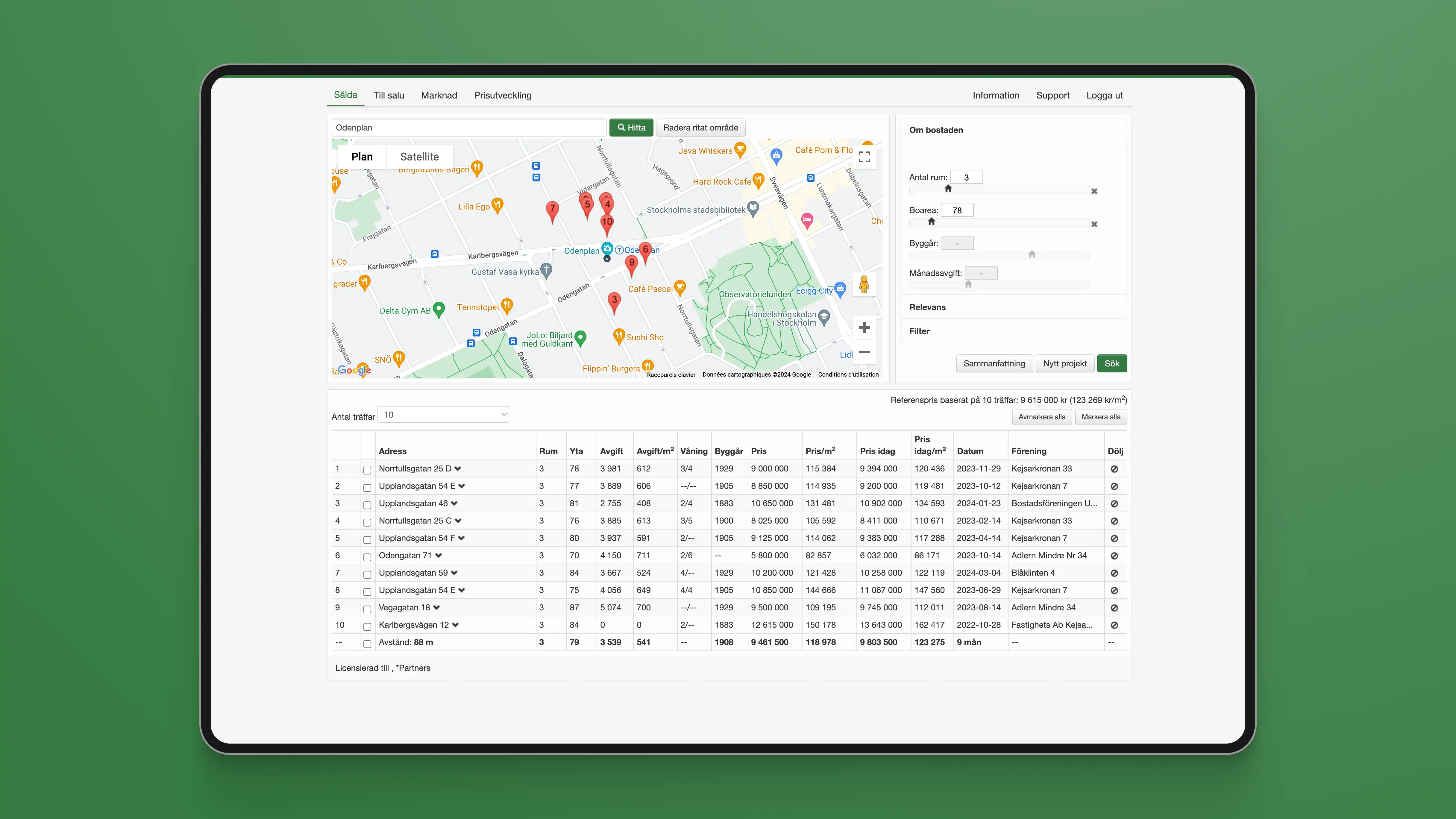
Valueguard has published a quality-adjusted price index (HOX®) for Swedish properties since 2005, and real estate professionals use their valuation service, Värderingstjänst, for data-driven decisions. The platform was running on outdated technology, and the project scope was a full redesign.
Context
Valueguard's valuation service holds detailed data on every property sold or listed in Sweden, with search, filtering, and market trend tools for agents.
I worked alongside Stefan Walet, Valueguard's Chief Production Officer, and Caroline Gard, a senior developer at Mpya Digital, on the UX and product design.
Problem
The existing platform was powerful but hard to use, built up over years by engineers without dedicated UX support. Talking to Valueguard's top clients surfaced four issues:
- Navigation: the platform was information-rich but hard to navigate, especially the map. Simple tasks took too many steps.
- Layout: users wanted control over how data was displayed instead of one fixed layout.
- Reports: generating a valuation report, a core feature, was unnecessarily complex.
- Mobile: the platform performed poorly on phones and tablets, a real problem for agents working in the field.
Users also ranged from power users relying on every feature to occasional users sticking to the basics, so the redesign had to work for both.
Approach
We focused on three things: personalization for individual users, customization so people could adjust the layout themselves, and efficiency features like keyboard shortcuts and touch gestures for power users.
Stefan Walet, Caroline Gard, and I mapped every part of the platform across a series of workshops, from screen layouts to map filters, refining the core flows:
- Quick address search
- Advanced search
- Filtering and refining results
- Selecting and customizing results
- Generating reports
- Managing saved searches
- Profile and settings
- Documentation and support
Those flows shaped a set of layout principles:
- Support agents managing multiple client projects at once.
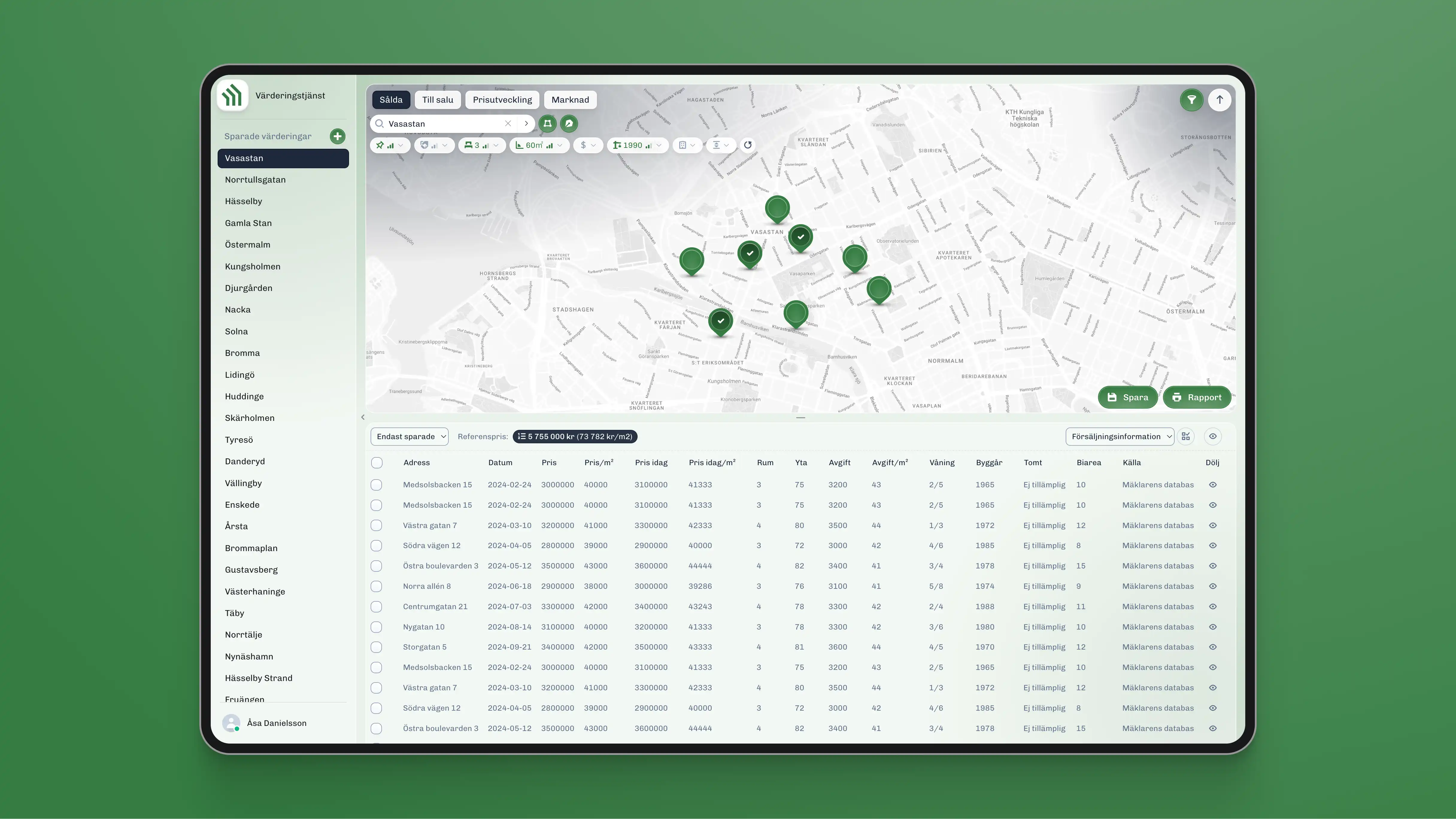
- Make panels and sections show/hide and expand/collapse, so users can choose map or list view.
- Keep filters compact but easy to reach and adjust.
- Put report generation one click away from anywhere in a project.
- Prioritize the map on mobile.
Outcome
We built a working React prototype to test the design in real scenarios, then added Hotjar to track how Valueguard's team actually used it once it reached their hands.

Some assumptions didn't hold: the top-right filter button placement worked fine despite initial concerns, and the expand/collapse slider for the side menu was intuitive without instruction.
After several rounds of adjustment based on that data, the design moved into full development.

Reflection
Redesigning a mature product with real, demanding users taught me more about prioritization than building something new would have. Every change had to be justified against how agents actually work day to day.
View live prototype